In a world where first impressions are everything, color is one of the most powerful tools a brand can use. Think about iconic brands like Coca-Cola, Tiffany & Co., or McDonald’s—can you imagine them without their signature red, teal blue, or golden arches? Probably not. That’s the magic of color psychology in branding.
Color is not just about aesthetics; it profoundly influences emotions, perceptions, and decision-making. In fact, research suggests that up to 90% of snap judgments made about products can be based on color alone. Understanding the science behind color psychology can therefore be the difference between a brand that resonates and one that fades into the background.
At Crazy Bunny, we dive deep into the fascinating world of color psychology — exploring how colors influence emotions, how brands carefully craft their color palettes to tell a story, and how you can harness the science of colors to build a stronger, more memorable brand.
What is Color Psychology?
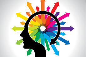
Color psychology is the study of how colors affect human behavior, mood, and perception. Our reactions to color are often rooted in biology, culture, and personal experiences. For example, red universally signals danger or urgency (think stop signs), but in China, it also symbolizes luck and prosperity.
Scientists believe that our brains are wired to respond emotionally to different hues. Certain colors can increase heart rates, trigger appetite, calm anxiety, or even foster trust. Marketers and designers leverage these emotional responses to subtly influence consumer behavior.
The Connection Between Color and Branding
Branding is the art of shaping perceptions. It is not only about logos or taglines; it is about building an emotional connection with the audience. Since color is one of the fastest visual cues the brain processes, it becomes a critical part of a brand’s identity.
When chosen thoughtfully, colors can:
-
Differentiate a brand from competitors
-
Communicate the brand’s personality and values
-
Influence purchase decisions
-
Build brand loyalty and recognition
A study by the Institute for Color Research revealed that people make a subconscious judgment about an environment or product within 90 seconds, and 62–90% of that assessment is based on color alone. That’s why brands meticulously choose color schemes that align with their mission, audience expectations, and desired emotional impact.
The Emotional and Psychological Effects of Colors
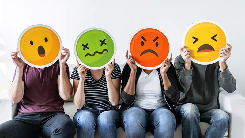
Let’s explore some of the most common colors used in branding and the feelings they generally evoke:
1. Red
-
Emotions: Passion, excitement, urgency, energy
-
Brand examples: Coca-Cola, Netflix, YouTube, McDonald’s
-
Usage: Red grabs attention and stimulates appetite, making it ideal for food, entertainment, and retail industries.
2. Blue
-
Emotions: Trust, security, calmness, professionalism
-
Brand examples: Facebook, Twitter, IBM, LinkedIn
-
Usage: Blue is a top choice for corporate businesses and tech companies aiming to build trust.
3. Yellow
-
Emotions: Happiness, optimism, warmth
-
Brand examples: McDonald’s, Snapchat, IKEA
-
Usage: Yellow captures youthful energy but must be used carefully—it can sometimes cause visual fatigue.
4. Green
-
Emotions: Health, nature, growth, peace
-
Brand examples: Starbucks, Whole Foods, Spotify
-
Usage: Green is favored by eco-friendly brands and those promoting balance and sustainability.
5. Orange
-
Emotions: Creativity, enthusiasm, affordability
-
Brand examples: Fanta, Nickelodeon, Amazon
-
Usage: Orange is playful and energetic, often used to appeal to youthful audiences.
6. Purple
-
Emotions: Luxury, royalty, wisdom, imagination
-
Brand examples: Cadbury, Hallmark, Yahoo
-
Usage: Purple is frequently used by brands that want to convey prestige or a creative spirit.
7. Black
-
Emotions: Sophistication, power, elegance
-
Brand examples: Chanel, Nike, Apple
-
Usage: Black is sleek and modern, often used in luxury branding.
8. White
-
Emotions: Purity, simplicity, cleanliness
-
Brand examples: Apple, Adidas
-
Usage: White represents minimalism and is popular in technology, health, and fashion industries.
Cultural Variations in Color Perception
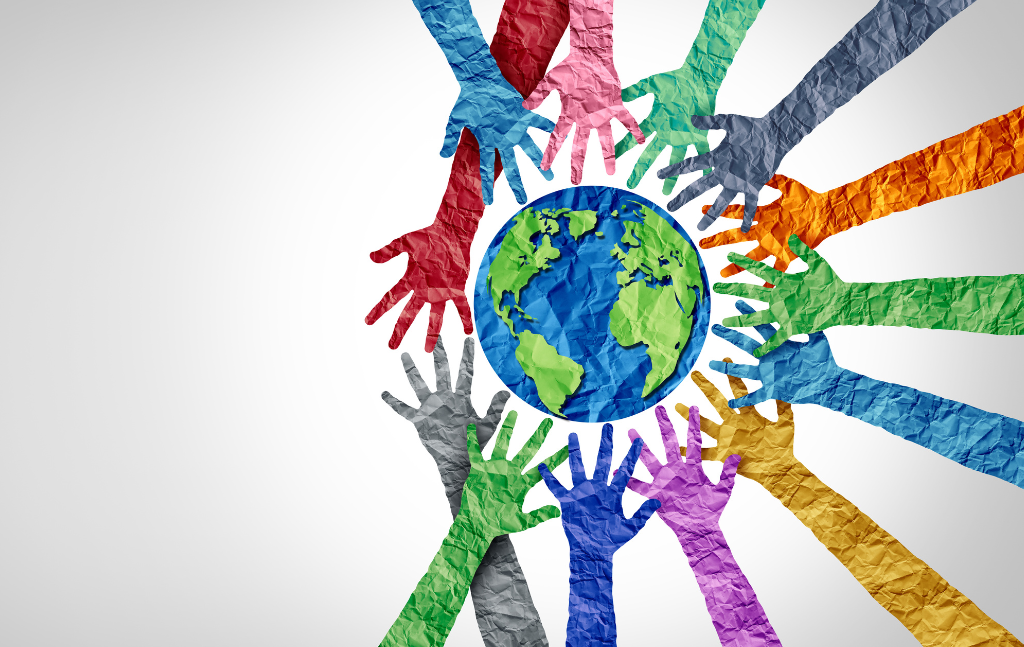
While some emotional responses to color are universal, others are highly cultural. This is crucial for brands operating globally.
For example:
-
In Western cultures, white often symbolizes purity and weddings. In Eastern cultures, it can represent mourning.
-
Red is a color of excitement and danger in Western countries, but in China and India, it’s associated with joy and celebration.
-
Purple denotes wealth in Western countries but can signify mourning in parts of South America.
Global brands often adapt their color strategies to fit the cultural context of the market they are entering.
The Science Behind Why Colors Affect Us
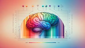
Color psychology is not just pop culture; it has biological and psychological roots.
-
Biology: Certain colors evoke specific biological responses. Red can increase heart rate and metabolism because our ancestors associated it with fire and danger.
-
Associations: Over time, we link colors to experiences. Blue skies signal good weather, green forests represent abundance, etc.
-
Cognitive Fluency: Humans prefer things that are easy to process. A brand color that “feels right” can improve memory retention and likability.
The limbic system in our brain, which is responsible for emotions, reacts almost instantly to colors. This reaction often happens before we even process the brand name or product description.
Case Studies: Brands That Nailed Color Psychology
![]()
1. Coca-Cola (Red)
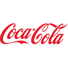
Coca-Cola’s vibrant red evokes excitement, energy, and passion. It stimulates appetite and is unforgettable in a retail environment full of competitors.
2. Tiffany & Co. (Blue)

The Tiffany Blue color, trademarked by the company, exudes luxury, trust, and timeless beauty. It differentiates the brand in a crowded jewelry market.
3. McDonald’s (Red and Yellow)

The combination of red and yellow is genius: red triggers hunger and urgency, while yellow evokes happiness and friendliness, creating the perfect environment for fast food.
4. Apple (White and Black)

Apple’s clean white branding suggests simplicity and innovation, while their use of black (especially in product launches) adds sophistication and mystery.
Choosing the Right Colors for Your Brand
Selecting brand colors is both an art and a science. Here are a few steps to guide the process:
1. Know Your Brand Personality
Are you bold and energetic? Calm and professional? Luxurious and exclusive? Choose colors that mirror these traits.
2. Understand Your Audience
What emotions or actions do you want to evoke? Consider the age, gender, culture, and interests of your target audience.
3. Study Competitors
Identify color trends within your industry—but find ways to stand out while staying relevant.
4. Test and Validate
Color perception can vary. Run A/B tests with your audience to see which color palette resonates the most.
5. Create a Palette
Use a primary color (main brand color), secondary colors (supporting colors), and accent colors (highlight important elements).
Common Mistakes to Avoid

While color psychology is powerful, misusing it can backfire. Here are common mistakes:
-
Ignoring Contrast and Accessibility: Your colors must be readable and accessible to everyone, including those with visual impairments.
-
Overcomplicating Your Palette: Too many colors can confuse your audience. Stick to 2–3 main colors.
-
Choosing Based on Personal Preferences: Your favorite color isn’t always what’s best for your brand.
The Future of Color in Branding
The digital era is pushing brands to rethink their color strategies constantly. Trends like dark mode interfaces, AR/VR experiences, and sustainability movements are influencing how brands use color.
Moreover, adaptive branding—where logos and color schemes shift based on context (platform, audience, event)—is becoming increasingly popular. The future will be less about rigid brand colors and more about dynamic color storytelling.
Conclusion
Color is not just a decorative element in branding; it’s a powerful psychological tool. When used strategically, it communicates your brand’s values, connects emotionally with audiences, and influences buying decisions—all in mere seconds.
Understanding the science behind color psychology equips you to make smarter branding choices that resonate deeper, last longer, and create memorable customer experiences.
So, the next time you pick a color for your brand or product, remember: you’re not just choosing a shade—you’re shaping an emotional journey.